Why Product Tours Need to Grow Up


Open ten SaaS apps tomorrow morning and you'll see them. The dotted highlight on a button. The card that floats next to a sidebar item. The "Let's get you started" sequence that walks you through three or four key features.
TL;DR
Product tours aren't obsolete – but the linear, scripted format most teams still use is starting to fail. Modern users expect onboarding that adapts to their behavior, carries AI-driven intelligence, and feels native to the product. The principle of in-app guidance is sound. The format needs to grow up.
Product tours have been a staple of in-app onboarding for more than a decade – and despite the louder corners of the SaaS internet that periodically declare them dead, they're not. The fundamental principle behind them is sound: when a user is inside your product, the most useful guidance is the kind that meets them where they are. Contextual. In-app. Actionable.
But there's a gap opening up. User expectations have shifted. User behavior has shifted. And the way we typically build product tours – linear, scripted, one-size-fits-all – hasn't kept up.
The good news: tours don't need to be retired. They need to grow up.
If you want to see how we've been rethinking this, our CPO Martin Fišera is hosting a live walkthrough on May 14 – there's a short video preview from him below. Otherwise, read on.
The principle still holds, and it's stronger than ever
In-app guidance remains the most effective channel for driving user activation, retention, and feature adoption – and the case for it has only grown stronger.
When a user signs up for a product, the gap between "I created an account" and "I got real value from this" is the biggest single predictor of whether they'll still be around in ninety days. Across the product-led growth space, activation timing now correlates more strongly with long-term retention than almost any other variable, including pricing tier or feature breadth. The teams who close the activation gap fastest – through clear, contextual guidance at the right moment – see outsized wins on retention, expansion, and customer lifetime value.
In-app guidance does this better than any of the alternatives. Email sequences land when attention is somewhere else. Help docs require users to leave the product to get help. Sales-led onboarding doesn't scale below the enterprise tier. The product itself, with the right nudge at the right moment, is still the most natural place to teach someone how to succeed.
That principle is sound. Every credible piece of research on product-led growth, user activation, and time-to-value reinforces it. The question was never whether to guide users in-app. The question has always been how.
Why today's users skip product tours
The user opening your product today isn't the user from 2016.
By now, the average SaaS user has been onboarded into hundreds of products. They've seen every variation of the pattern. They know what a tour looks like, and they know how to skip one. The "click Next, click Next, click Next" rhythm has become so familiar that users dismiss it almost reflexively – not because the guidance was bad, but more often because the timing or targeting was wrong.
At the same time, expectations of what software feels like have leveled up. People now expect their tools to feel intelligent. They expect chat interfaces that understand context. They expect personalization that goes beyond a first name in a greeting. They expect that if a product asks them "what brings you here today?", the experience that follows actually adapts based on the answer.
A static, linear tour struggles to meet any of those expectations. Not because the underlying principle is wrong, but because the format itself is too narrow for what users now consider table stakes in modern SaaS.
How user behavior has changed in modern SaaS
User behavior has shifted as dramatically as user expectations – and modern self-serve adoption no longer follows the linear path classic product tours were designed for.
Users today rarely move through your product in a clean sequence. They sign up. They poke around. They leave. They come back three days later, jump straight to the feature they actually came for, ignore everything else, and maybe – on day fourteen – decide they want the full picture. Modern self-serve adoption isn't a script. It's a pattern of curiosity, distraction, and selective deep-dives.
Products themselves have grown, too. The average mature SaaS app has three or four times the surface area it did a decade ago. There's no realistic way to tour every important feature in a single sequence. And there's no single "Day 1 user" to design for: your product is being learned by power users, casual users, admins, end users, and the procurement team, all with different jobs to be done and different definitions of success.
A linear tour assumes a single ideal path through your product. The way real users actually move through it doesn't look anything like that.
What modern in-app onboarding needs to do
If the principle is right and the format needs to catch up, modern in-app guidance has to do four things to match how users actually behave today.
It needs to adapt to behavior, not push through it.
A tour shouldn't keep advancing while a user is trying to do something else. It should branch when they branch, wait when they pause, and resume when they're ready. The "Next" button should be one option, not the only one.
It needs to carry intelligence inside the experience.
AI is now table stakes in modern software. Users expect their tools to understand context, anticipate questions, and respond conversationally. Onboarding that ignores AI's role in the product experience feels dated the moment it appears – and the experiences that lean into AI thoughtfully (with the human still firmly in control of the message) are the ones users actually engage with.
It needs to be easier to build and update.
The reason most onboarding programs stall isn't that teams stopped caring. It's that the tools made every change so painful – CSS selectors, dev tickets, brittle attachments – that updating an existing tour cost more than building a new one. The format has to make iteration cheap. Otherwise, onboarding stops evolving alongside the product, and users feel that drift.
It needs to feel like the product itself.
Branding consistency, design polish, and content quality aren't optional anymore. Users notice when an overlay looks pasted on top of an interface, and they treat it accordingly. The most effective in-app guidance feels like a native part of the product – not a layer applied after the fact. Consistent theming and design systems are what separate professional onboarding from the kind users dismiss on sight.
None of these are radical departures from what product tours have always tried to do. They're the natural next step.
The format is evolving – the principle isn't
If you've sensed that classic product tours aren't doing the job they used to, you're not wrong. But the answer isn't to abandon in-app guidance. It's to give it the tools and the format it needs to keep up with the users it's designed to help.
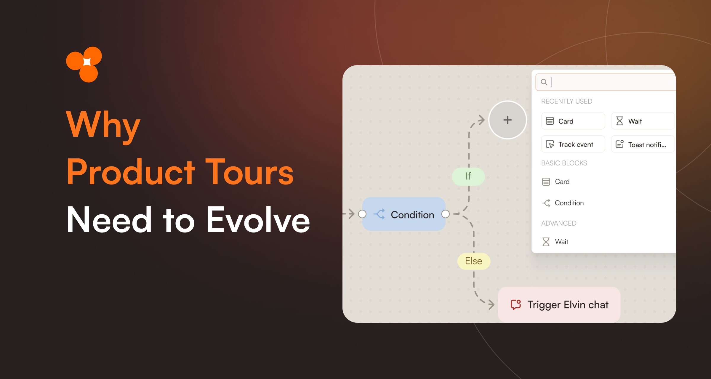
That's the shift we've been investing in at Product Fruits. The fundamental belief – that the most useful guidance is the kind that meets users in the product, in context – hasn't moved. What's changed is what we now think a tour actually needs to be: visual to build, behavior-aware to run, AI-assisted from day one, and easy enough to maintain that it grows with your product instead of falling behind it.
We'll be sharing the next chapter of that work – what we call Flows – in a live walkthrough with our CPO Martin Fišera on May 14. If you've been thinking about where in-app onboarding and digital adoption are heading, that's the conversation worth being in. Se a short example about visual themes in Flows admin interface below (and register for webinar to see entire Flows in action).
Product tours aren't dying. They're growing up. And the teams that help them grow up first will earn the next decade of activation wins.
Key takeaways
- The fundamental principle of in-app onboarding – guiding users in context, inside the product – is more relevant than ever.
- Linear, scripted product tours no longer match how today's users behave or what they expect from modern software.
- Modern in-app guidance needs to adapt to user behavior, carry AI-driven intelligence, be easy to maintain, and feel native to the product.
- Most failed product tours fail not because users don't need guidance, but because the format hasn't kept up with how users actually move through software.
- The format is evolving. The principle isn't.
Frequently asked questions
Are product tours still effective?
Yes – when designed well. The fundamental principle of in-app guidance, meeting users with help inside the product at the right moment, remains the most reliable way to drive activation, retention, and feature adoption. What's changed is user expectations: today's users skip linear, scripted tours but engage with onboarding that adapts to their behavior and respects their attention.
Why do users skip product tours?
Most users skip product tours because the format itself signals predictability – they've seen hundreds of "click Next" sequences and learned to dismiss them by reflex. The skip rate isn't a verdict on whether guidance is needed; it's a verdict on whether the timing, targeting, and format match what the user is actually trying to do in that moment.
What's the difference between a classic product tour and a modern user onboarding flow?
A classic product tour is a linear sequence of steps: card, click Next, card, click Next. A modern user onboarding flow branches based on user behavior, waits for real actions (not just clicks), can incorporate AI-generated content, and is designed as a network of guidance rather than a single path. Same goal – helping users succeed – but a much more flexible format.
How is AI changing in-app onboarding?
AI is changing in-app onboarding in two main ways. First, it's accelerating creation: AI can record an admin's clicks through their app and draft the first version of a flow automatically, dramatically cutting time-to-publish. Second, it's enriching the experience itself: in-app AI assistants can answer user questions in context, hand off from a tour to a chat, or pre-seed an interaction with what the admin wants the user to focus on. The strongest use of AI in onboarding is as a co-pilot for the human admin – not a replacement.
What makes a modern product tour effective?
Effective modern in-app guidance does four things: it adapts to user behavior rather than pushing through it; it carries intelligent, contextual content rather than static text; it's easy enough to update that it evolves alongside the product; and it feels native to the product itself, not like a generic overlay. Tours that get all four right consistently outperform their classic linear predecessors on activation, completion, and feature adoption.
Save your seat for the May 14 walkthrough →


Weekly newsletter
Get the latest releases, tips, articles, and exclusive interviews delivered to your inbox weekly—no spam!